- 31/05/2019
- Posted by: Macgad
- Category: Digital Marketing, Website Design

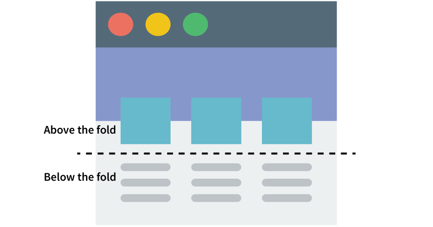
When a visitor lands on your website, you only have one chance to make a good first impression. The best way to do this? By paying attention to what you put “above the fold” on your website. The “above the fold” portion of your site is the part that shows on the visitor’s screen (whether desktop, tablet, or mobile) without them having to scroll down. This is one of the most crucial portions of your website, as it needs to convey a concise but effective message using very limited time and space.
Here are 3 essential elements that you should have “above the fold” of your website to make an effective first impression with your corporate website.
Corporate Branding
First and foremost, the visitor should be able to immediately recognize that they are on your company’s site. To achieve this, ensure your logo is displayed clearly at the top of your website, along with your company name or brand (if your logo doesn’t already contain your company name). Ensure your website is designed with your corporate colours, using fonts and images that suit your corporate branding and the vibe you want to convey.
A Short Message
Use titles, subtitles, and/or short descriptions to give your visitor a brief idea of what your site is about. This is your chance to grab their attention with a catchy tagline, intriguing question, or sentence that they can relate to. The goal of this element is to make them want to stay, get more information, and take your desired action.
Call to Action Button
Last but by no means least, include a Call to Action (CTA) – encourage your visitors to take the action you desire (e.g. Learn More, Contact Us, Shop Now). Bonus points if you make it clickable so that your visitors can easily navigate to wherever they need to without having to scroll or click around to find it!
Incorporate these 3 elements onto your website, and you’ll be all set to make a great first impression via your corporate website. Be sure to test your site on all device sizes, as sometimes elements can shift, causing a poor user experience (e.g. a logo that is too large, pushing the Call to Action below the fold on a mobile device). You may have to make some adaptations to ensure all the elements are visible on all devices, but the payoff will be worth it!

